2
no. of Devices
2
NO. OF TEAM MEMBERS
20+
No. of screens
1
duration in months
Mesha Project Timeline
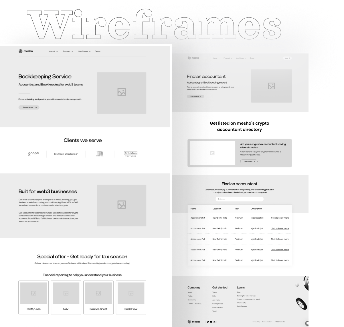
Various UX processes were followed to come up with a suitable solution. Below is a quick glance at the project timeline
and the approach followed during the course of project.
and the approach followed during the course of project.

Brand Colors
Typeface & Colors
Fonts were selected carefully to match the brand identity i.e. playful, inviting and young. Space mono was selected to be used for most of the body content and Raleway as a complimentary font for headings or to make content pop where required. Both the fonts appear really nice when put together in an organized manner and Brand colors were used to maintain the consistency and to reflect the unique personality of the brand.


Want to be partners in design?
We'd love to discover more about you and collaborate on designing and building together.

